
Introduction
In the realm of data analysis and visualization, precision and clarity are paramount. Error bars in Excel are a powerful tool that enhances your data presentation by providing a visual representation of the variability or uncertainty in your data. Whether you’re a student, researcher, or professional, understanding how to add and customize error bars in Excel can significantly improve your charts’ interpretability. This comprehensive guide will walk you through the process step-by-step, ensuring you can confidently use error bars to present your data accurately.
Error Bars
Error bars are graphical representations of the variability of data and are used on graphs to indicate the error, or uncertainty, in a reported measurement. They provide a visual cue to the viewer about the reliability of the data. By showing how much data varies, error bars help in understanding the degree of error or confidence in a measurement.
Types of Error Bars
Excel offers several types of error bars, including:
- Standard Error: Shows the standard error of the mean for each data point.
- Percentage: Shows error as a percentage of each data point.
- Standard Deviation: Represents the standard deviation of the dataset.
- Custom: Allows for custom values to be input for error bars.
Preparing Your Data
Before adding error bars, ensure your data is well-organized. Each series of data points should be clearly defined, and any statistical measures (like standard error or standard deviation) should be calculated and ready for use. Having your data well-prepared will streamline the process of adding error bars.
Creating a Basic Chart in Excel
To start, you need a basic chart where error bars will be added. Here’s how to create one:
- Input Data: Enter your data into an Excel spreadsheet.
- Select Data: Highlight the range of data you want to chart.
- Insert Chart: Go to the
Inserttab and choose the type of chart you want (e.g., line, bar, scatter). - Customize Chart: Make initial adjustments to your chart for clarity and presentation.
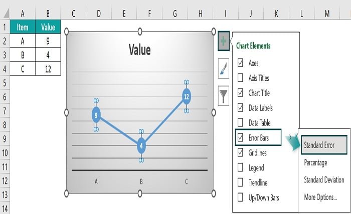
Adding Standard Error Bars
- Select Chart: Click on your chart to select it.
- Add Error Bars: Go to
Chart Tools->Design->Add Chart Element->Error Bars. - Choose Standard Error: Select
Standard Errorfrom the dropdown menu. - Adjust if Necessary: Modify the appearance and range of the error bars through the
Format Error Barspane.
Customizing Error Bars
Customization options in Excel allow you to modify the appearance of your error bars to better fit your chart’s aesthetic:
- Format Error Bars: Click on the error bars in your chart, then go to
Format->Error Bars. - Adjust Style: Change the color, width, and cap length to match your chart design.
- Set Error Amount: Specify the error amount if using custom or percentage error bars.
Adding Error Bars to Specific Data Series
If you have multiple data series in your chart and need error bars for only specific ones:
- Select Data Series: Click on the data series in the chart.
- Add Error Bars: Go to
Chart Tools->Design->Add Chart Element->Error Bars. - Customize for Series: Adjust the error bars for that specific series using the
Format Error Barspane.
Using Percentage Error Bars
Percentage error bars are useful when you want the error to be proportional to the data values:
- Select Chart: Click on your chart.
- Add Error Bars: Go to
Chart Tools->Design->Add Chart Element->Error Bars. - Choose Percentage: Select
Percentagefrom the dropdown menu and input the desired percentage.
Applying Standard Deviation Error Bars
Standard deviation error bars are ideal for showing the variability within your dataset:
- Select Chart: Click on your chart.
- Add Error Bars: Go to
Chart Tools->Design->Add Chart Element->Error Bars. - Choose Standard Deviation: Select
Standard Deviationfrom the dropdown menu.
Incorporating Custom Error Values
For more precise control, custom error bars allow you to input specific error values:
- Prepare Custom Values: Calculate and input your custom error values into your spreadsheet.
- Select Chart: Click on your chart.
- Add Error Bars: Go to
Chart Tools->Design->Add Chart Element->Error Bars. - Select Custom: Choose
More Error Bar Optionsand thenCustom. - Specify Values: Input your custom values for both positive and negative error bars.
Interpreting Error Bars in Your Data
Interpreting error bars correctly is crucial for drawing meaningful conclusions from your data:
- Analyze Overlaps: Overlapping error bars often indicate that there is no significant difference between data points.
- Assess Variability: Wider error bars signify greater variability or uncertainty in the data.
- Consider Context: Always interpret error bars within the context of the specific data and research question.
Common Mistakes to Avoid
Avoid these common pitfalls when adding error bars in Excel:
- Inaccurate Calculations: Ensure your error values are calculated correctly.
- Misleading Representation: Don’t use error bars to misrepresent the reliability of your data.
- Overcrowded Charts: Avoid adding too many error bars which can make the chart difficult to read.
Tips for Effective Data Presentation
Effective data presentation enhances comprehension and impact:
- Keep it Simple: Clear and simple charts are easier to interpret.
- Label Clearly: Ensure all elements of your chart, including error bars, are well-labeled.
- Use Color Wisely: Use contrasting colors to highlight error bars without overwhelming the viewer.
Advanced Techniques with Error Bars
For those looking to go beyond the basics, consider these advanced techniques:
- Dynamic Error Bars: Use Excel formulas to create dynamic error bars that update with your data.
- Combine Error Bars with Trendlines: Enhance your charts by combining error bars with trendlines for deeper analysis.
- Automate with Macros: Use Excel macros to automate the addition and customization of error bars in large datasets.
Conclusion
Mastering the use of error bars in Excel is a valuable skill that can significantly enhance your data analysis and presentation. By following the steps outlined in this guide, you can confidently add and customize error bars to your charts, providing a clearer picture of your data’s variability and reliability. Whether you’re preparing a report, conducting research, or presenting findings, error bars are an essential tool for conveying the precision and accuracy of your data.
FAQs
1. What are error bars in Excel used for? Error bars are used to represent the variability or uncertainty in a data set, providing a visual cue about the reliability of the data.
2. How do I add custom error bars in Excel? To add custom error bars, select your chart, go to Chart Tools -> Design -> Add Chart Element -> Error Bars -> More Error Bar Options -> Custom, and input your custom values.
3. Can I add error bars to a specific data series in a multi-series chart? Yes, you can add error bars to specific data series by selecting the series and then adding error bars through the Chart Tools.
4. What is the difference between standard error and standard deviation error bars? Standard error bars represent the standard error of the mean, indicating how much the sample mean is expected to vary. Standard deviation error bars represent the variability within the data set.
5. How do I customize the appearance of error bars in Excel? You can customize the appearance of error bars by selecting them and then using the Format Error Bars pane to adjust style, color, width, and other properties.